After almost 30 years in IT one of biggest pet-peeves is having to maintain multiple versions of a 15-page resume. You know that nobody except desperate recruiters would even look at it, and that’s only because your odds of getting a hit in their search engines for multiple “key words” create a link that they click on.
My wife, the owner of Burnt Toast Productions, (a promotional products and brand consulting company), came up with an amazing idea, she asked me if I could apply some of my presentations skills to come up with a 1-page version of my resume. At first, I told her she was insane, that perhaps I could dump MAYBE the first 10 years of my CV, since in today’s world people simply would not care about what I did in the 1980’s, except maybe those who were older like myself – 🙂
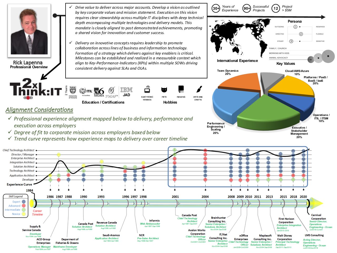
Then she started to sketch-out a layout which was designed to be very graphical in nature. In her view the real content would come from visualizations of key elements with a primary focus on giving the reviewer an overall “impression” as to who I am, where i’ve been, and what i’ve done. The kicker is she said it needed to be understood by the person looking at it in 3 seconds. The individual had only 3 seconds to scan it and see if they wanted to go further. So the challenge was on!
I put on my EA hat and started brain-storming some concepts. It occurred to me she was 100% right, why couldn’t I come up with some key visualizations, rather than words to explain my value proposition.
We collaborated on multiple versions, my first attempts she pointed out were too “wordy”, and that I was not making proper use of the limited geography available on an 8.5 x 11 page. Each revision I sent was met with a return email of: No. Nope. Un-uh, try again… By the time we were done, my creativity and presentation skills partnered with her graphical acumen and keen eye resulted in the design you see here.
It is formatted into key sections with an opening value-statement which is intended to pin-point who I am, what I do, and what value I bring in my own words in one paragraph. I decided to take it one step further and make it fully interactive, which means it leverages hyperlinks which tie back to my personal website which contains all the details. Point is, you don’t click on what you don’t want to see, but the information you may be interested is there for you to deep dive.
While it took a great deal of effort to build the design, the idea and the concepts came from her and for that I am very thankful – she is extremely creative and has an eye for visualization.
Thanks You Burnt Toast Productions.

Update:
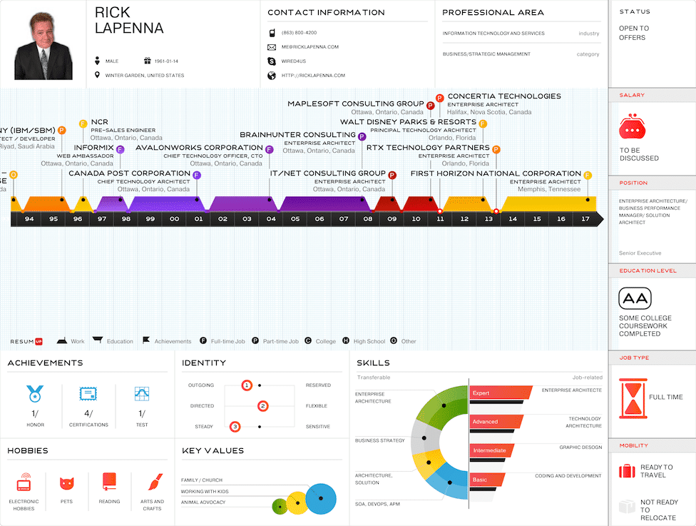
After developing this 1-page resume a friend of mine pointed out that there was a site called ResumUP which provided a similar concept. I checked it out, and sure enough this is a very powerful tool as well. It can develop the content directly from your LinkedIn profile to generate very visual representations of your CV, take a look.


Comments 1
Author
Since I have written this post I have come to discover that there is a website called ResumUP and I updated the post with this information as well.