Generic Application Integration Diagram Template
$25.99
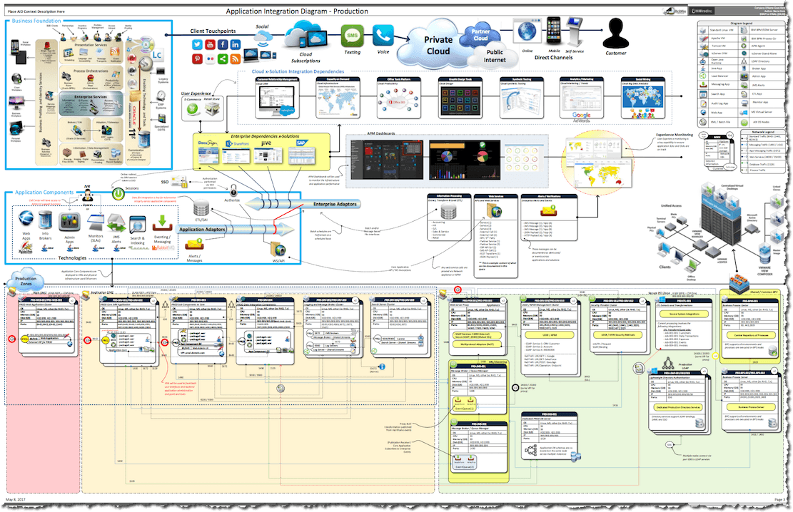
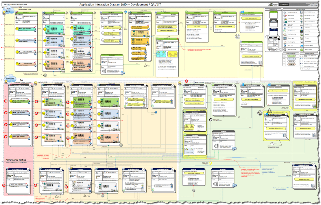
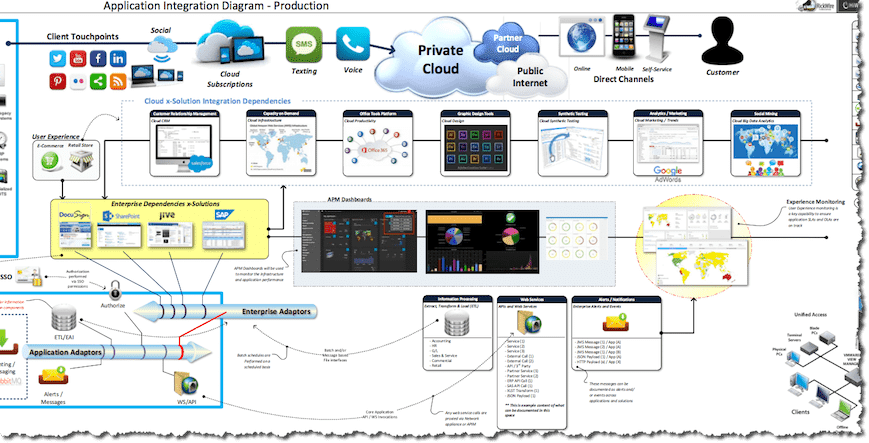
Creating Application Integration Diagrams (AIDs) can be challenging? This three page Visio template contains a complete visualization of both Non-Production and Production perspectives with multiple environments covered, such as DEV, QA, SIT and PROD. The package also includes multiple perspectives (Business, Development, Engineering and DevOPS), which can be shared across teams, getting everyone on the same page – which is key when dealing with complex solutions.
Description
This package is a comprehensive tool to illustrate highly complex concepts for application landscapes. It is intended to illustrate many difficult to explain relationships to bring various teams together and create a common understanding of the solution components.
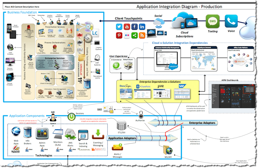
The diagram covers the contextual view from a business perspective, creating visuals that the business understands and brings them into alignment with the technology teams. They will gain an understanding of dependencies involved to deliver those business capabilities. Creating a common vision is critical ensure all the teams become aware of one another’s role and the value each team brings to the delivery process.
The diagram has been developed in Visio; however by blending external logos, images and content stunning visualizations can be designed. The material contained in the package has been engineered to allow authors to quickly customize the various objects contained within the diagrams to create their own landscape content. Some of the more complex images, such as the VMWare objects and embedded PowerPoint images can be easily substituted with your compnay’s existing images and branding.
The Visio is divided into three parts (across six tabs):
- There are 3 header sections
- Change Log
- Non-Production
- Production
- The 3 pages contain the corresponding content for each header section
- Change Log Notes
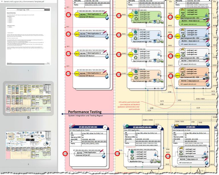
- Non-Production Environments
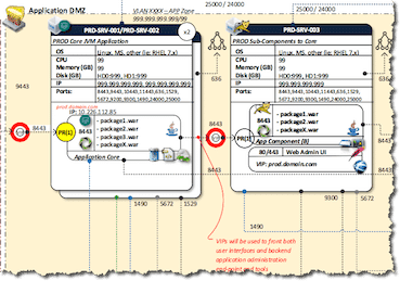
- Production Environments
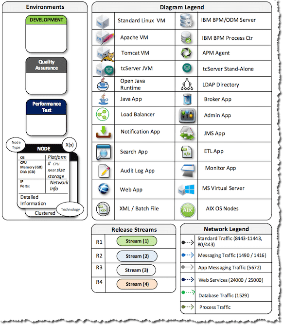
While the diagrams can appear to be complex they are designed for multiple consumers. Content can be removed to simplify the landscape depending on your requirements. It has been my experience that the highest value is obtained by allowing developers and engineers to see the landscape in a consistent manner. Project managers also find it useful, since they can visualize complexity when creating tasks and milestones. Each environment view comes with a detailed legends covering multiple aspects of the landscape. These can also be tweaked depending on the level of detail required,
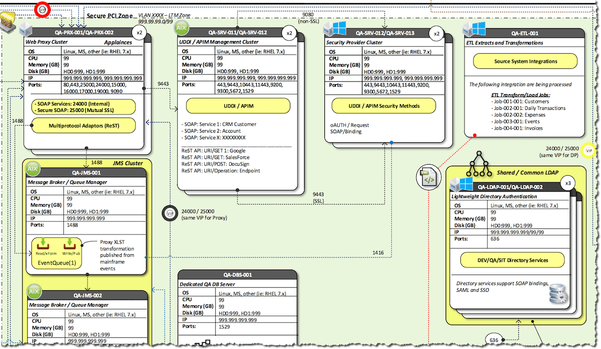
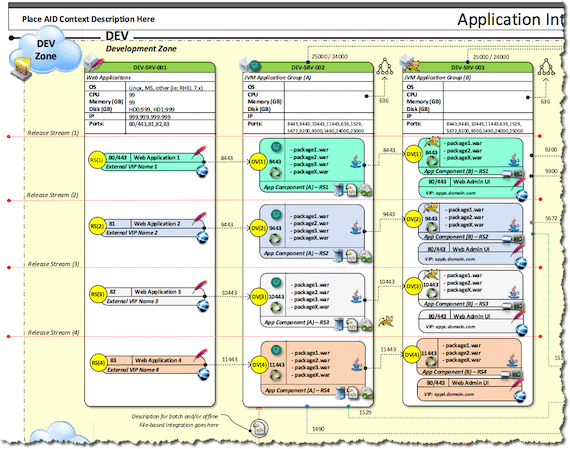
The various icons used in the diagram provide a quick visual to quickly identify the characteristics of a node, its function and its connectivity. The diagram is modeled from a hybrid Java solution landscape which leveraged multiple technologies; Lucene, RabbitMQ, LogStash, JVMs, Oracle, AD/LDAP and so on. The port references in the model reflect those mappings, but those port references can be easily changed or even removed if needed and substituted based on your technology stack.
Same is true for Node/Server objects. Many of the objects have been ungrouped to make it easier for authors to change the content, these may also be regrouped for duplication and/or global modification. The intent was to allow icons to be placed on a node box to show not only the node physical characteristics, but also the technologies in use on that node.
The diagrams are structured to cover various aspects of provisioning, for example:
- Physical form-factors (CPU, Memory, Storage, Network)
- Type of Node (Virtual / Physical)
- Node Names (Operational reference and description)
- Multi-instance provisioning (helpful to indicate performance and HA)
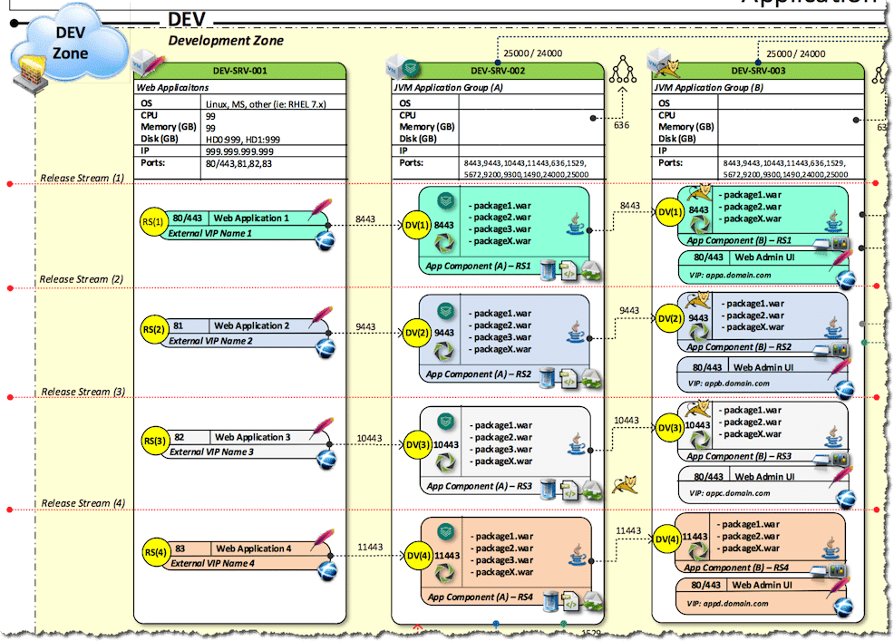
- Technologies in use (runtime, packages and release streams)
- Network connectivity (ports, VIPs, Zones, VLAN)
The node representation is also designed to show application components such as packages required for deployment; therefore these diagrams also become useful to QA and Application Support, since they can be used to show the actual contents of a release stream at the package level. In the non-production diagram, it is developed to show 4 parallel release streams, the author can of course customize this to meet their own requirements.
The diagrams are designed to be saved as PDF once completed and then printed as posters on ANSI-D and/or ANSI-E sized paper (normally a plotter). If you do not own a plotter, by saving the diagram in these formats you can easily have them printed at any office store (such as Office Max).
The source of the external graphics contained in the diagram are NOT provided. Many of the icons can be downloaded directly from ICON Archive. Source for the Business illustrations can be purchased as a PowerPoint template, please contact me to discuss options.
The package comes complete with the Visio diagram in both Visio 2016 and backward compatible versions supporting Visio 2003-2010. A fully generated PDF of all three pages for poster printing is also provided.
Reviews
There are no reviews yet.